Bury Hospice Pitch
By Wayne SilcockWe were recently invited to pitch to Bury Hospice to refresh and rebrand them on the run-up to the opening of a brand new, state-of-the-art care facility.
We didn\'t win the pitch on this occasion. Normally, "unsuccessful" pitch artwork never gets to see the light of day, but we were happy with the work we produced and think it deserves at least a blog post!
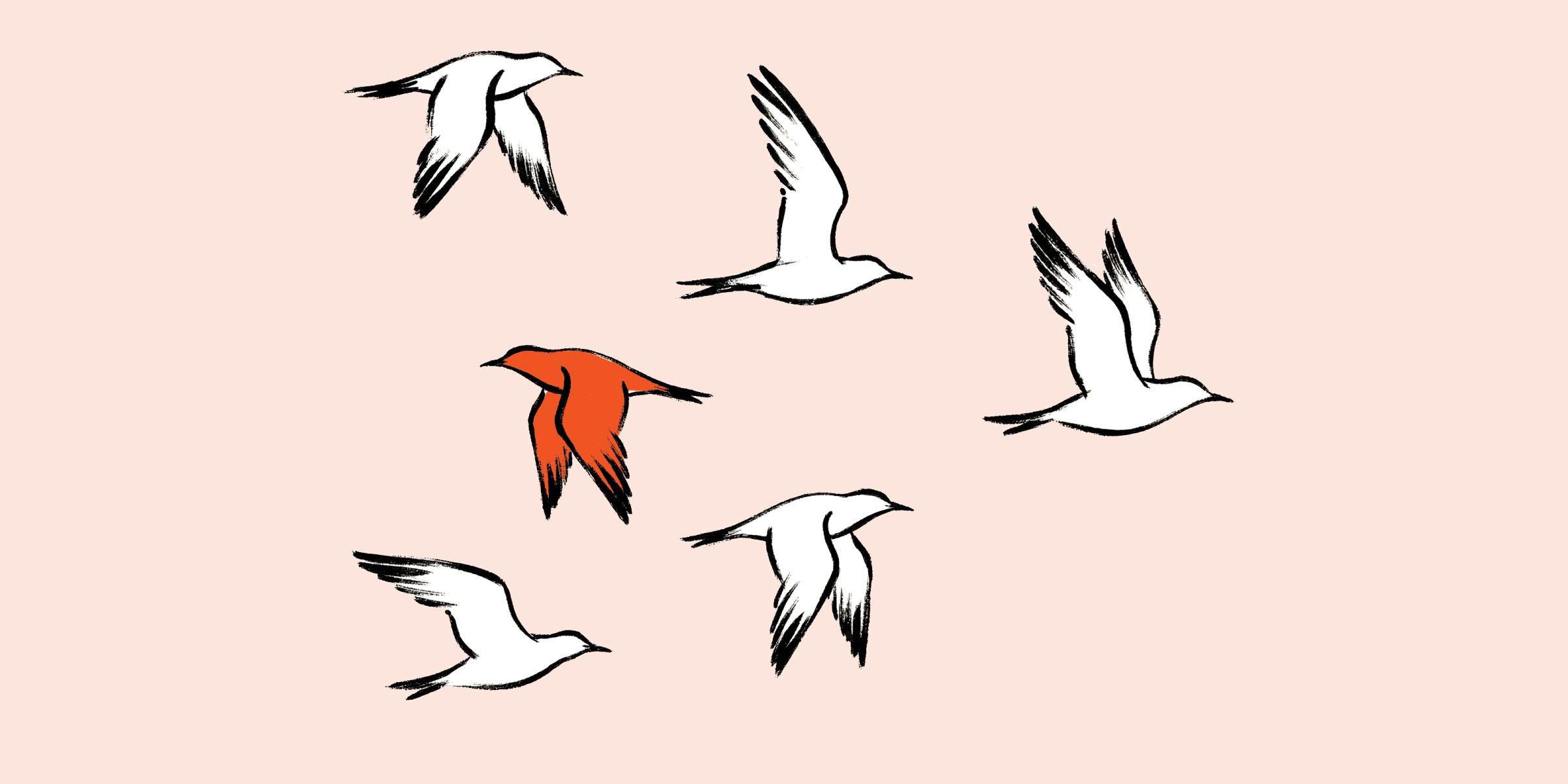
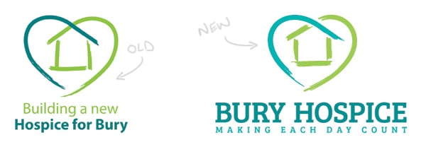
With an already fractured brand identity to contend with, we created a solution which involved the "refresh" and extention of some of their existing brand assets to create a consistent identity for local people and businesses to rally behind. The resulting logo we created was re-drawn from 6 individual strokes to represent the 6 areas of Bury, and paired with a new typeface.
A new brand message was also created off the back of our research. This message highlighted the work the hospice do - making the time their patients have left matter and easing the process for their families. This was done without glossing over the simple fact that people sadly go to the hospice at the end of their lives. Part of our suggested marketing and PR campaign worked to challenge the perception that it is mainly elderly people who use the hospice - when in actual fact many of the patients and residents are much younger people.
You can see a small selection of the artwork we produced for the pitch here...

We were recently invited to pitch to Bury Hospice to refresh and rebrand them on the run-up to the opening of a brand new, state-of-the-art care facility.
We didn\'t win the pitch on this occasion. Normally, "unsuccessful" pitch artwork never gets to see the light of day, but we were happy with the work we produced and think it deserves at least a blog post!
With an already fractured brand identity to contend with, we created a solution which involved the "refresh" and extention of some of their existing brand assets to create a consistent identity for local people and businesses to rally behind. The resulting logo we created was re-drawn from 6 individual strokes to represent the 6 areas of Bury, and paired with a new typeface.
A new brand message was also created off the back of our research. This message highlighted the work the hospice do - making the time their patients have left matter and easing the process for their families. This was done without glossing over the simple fact that people sadly go to the hospice at the end of their lives. Part of our suggested marketing and PR campaign worked to challenge the perception that it is mainly elderly people who use the hospice - when in actual fact many of the patients and residents are much younger people.
You can see a small selection of the artwork we produced for the pitch here...
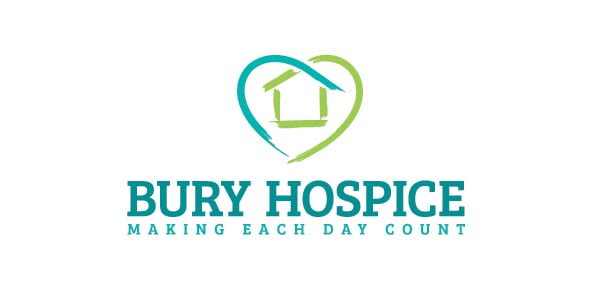
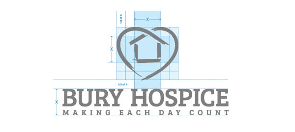
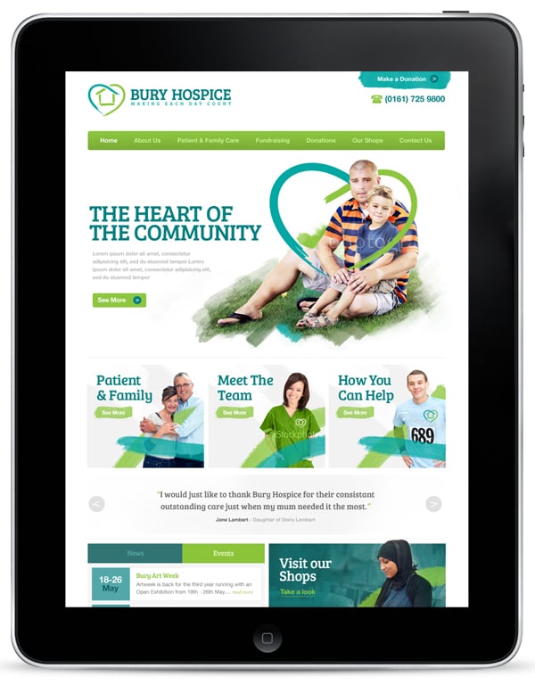
We produced some standard variants of the refreshed logo, with some very brief guides on usage and outlines of how the typography and colour should be treated if the brand was to be moved forwards. The website design was to be a key part of the new brand strategy - and for the purposes of this pitch we created several concepts and wireframes to show how this could work as a platform for the hospice to raise both visibility and donations.
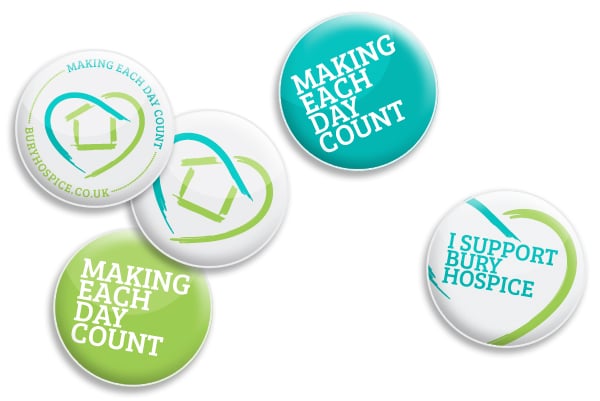
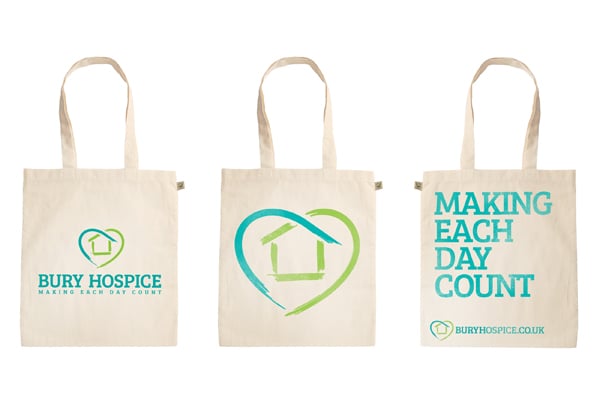
Some other suggestions were also put forward for small, low-cost items which could be used to give their chain of hospice shops some much needed identity and raise funds at the counter. Pin badges and tote bags were just some of the ideas to push this message, along with suggestions for branding the interiors of the shops and utilising shop frontages to encourage donations with window vinyls and clear signage.
We really enjoyed the whole process of this pitch and the team at Bury Hospice were extremely helpful. We are really looking forward to seeing what the winning agency comes up with to promote their great new facility in the coming year.