Giggleswick Brand Guidelines
By Wayne SilcockWe have enjoyed worked with Giggleswick School for a number of years now, getting involved and helping their departments with online and offline communications. Their brand image needed some unification and a bit of a "spring clean" to get everything looking fresh to take the school into 2012 – their 500th celebratory year.

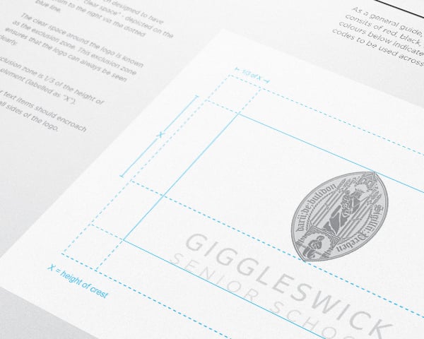
We have enjoyed working with Giggleswick School for a number of years now, getting involved and helping their departments with online and offline communications. Their brand image needed some unification and a bit of a "spring clean" to get everything looking fresh to take the school into 2012 – their 500th celebratory year.
The first job was to get a grip of every current brand asset from the past few years, and lay them all out so we could see a big snapshot of where the Giggleswick brand image currently was. It was clear that there was a lack of identity to separate the Senior and Junior sides of the school (which have two distinct audiences..) coupled with inconsistent delivery of the brand image as a whole across a lot of the materials created in-house at the school. Involvement from a number of departments meant that type usage, colour and layout was vastly different across the board.
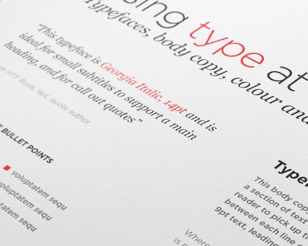
Absolute created distinct sub-brands for the Senior and Junior school linking back to the historic colours used in the pupil uniforms. These are governed by an over-arching set of brand rules, which covered type usage, layout, tone of voice, colour, logo variants – even materials and paper usage. This was packaged up as a 60 page printed reference book with a companion digital version for distribution across the school.
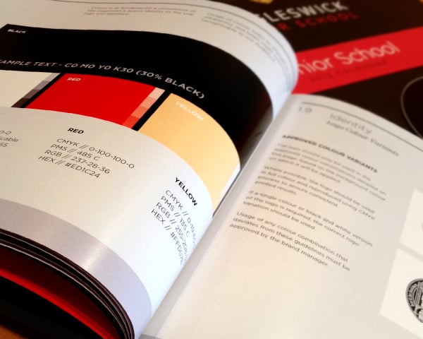
The whole process stretched across 3 months and involved essential collaboration with the team at the school, who were now tasked as “brand defenders” to ensure that the rules were adhered to in the future!