Wim Crouwel @ Design Museum London
By Wayne Silcock
Recently, I was fortunate enough to check out the Wim Crouwel exhibition at the London Design Museum.
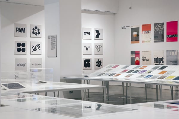
(photo used in this article property of the respective owner)
I first became familiar with the Dutch graphic designer\'s work way back in college, where a friend showed me a book featuring some of his typographic work. I was blown away that he was producing work that looked modern and fresh today, but way back in the 1960s!
The exhibition (curated by Spin\'s Tony Brook) was fantastic and gave an insight into Wim Crouwel\'s background, working methods, his mastery of grid systems, and his influence on other designers.
It was fascinating to see his initial sketches of his typefaces and to see how he constantly refined his work, meeting design problems in the development of his typefaces with simple yet elegant solutions.
One highlight was watching a short interview where he explained how the technical limitations of new digital typesetting technology gave him a direction on how to develop his typefaces. The new machine could not render curves very well, so Crouwel developed a typeface around this limitation, utilising straight lines and only 90 or 45 degree angles ensuring consistent and clean reproduction.
Seeing his approach and body of work was really inspiring and has given me some fresh ideas for how we can approach our work here at Absolute.
The exhibition runs until the 3rd July at the Design Museum and is well worth a visit.
http://designmuseum.org/exhibitions/2011/wim-crouwel