Branding Absolute – 25 Years Bold
By Simon AllmanBranding start-ups. Branding products. Branding services. Brand development. Brand positioning. Brand re-positioning. Brand naming. We’ve done just about every kind of branding for our clients over 25 years. But what about branding ourselves? Let’s rewind the clock and look at how it all began.

The Absolute that you see today looks completely different to the one that started out 25 years ago. Back in 1999, our MD Chris headed back north from working in London, at Reuters, to start his own creative design agency that became well-known for creating CD Roms (remember them?) for brands like Honda, Mattel, Kodak, BAe Systems, BMI Healthcare and many more.
Way back then, the Yellow Pages (remember that?) was still a big part of our daily lives when searching for businesses. The trend for any start-up was to give it a name with an initial that would put you up front in the big yellow directory. This made booking a taxi on a Saturday night a bit easier as most of them were called ABC Taxis, or ABA Taxis. So Chris followed that strategy and named his new business ‘Absolute’. Well, ‘Absolute Media Solutions’ to be precise.
Once Chris was happy with the name, he now needed a brand identity, so his team set about creating one. At this point in our design history, Adobe Photoshop was becoming a popular application to experiment in, especially in the creative community. You could achieve things that hadn’t really been possible before when designing in the traditional way. Yes, we saw a lot of glows and shines, layered effects with drop shadows, bevelled and embossed shapes, or anything else your imagination could think of.
The brief to the team – the brand had to be orange, to match the colour of his hair. And there had to be a circular shape in the design to reflect the CD Rom. The chosen brand was very much on trend, and it gave Absolute an identity to build a business with.
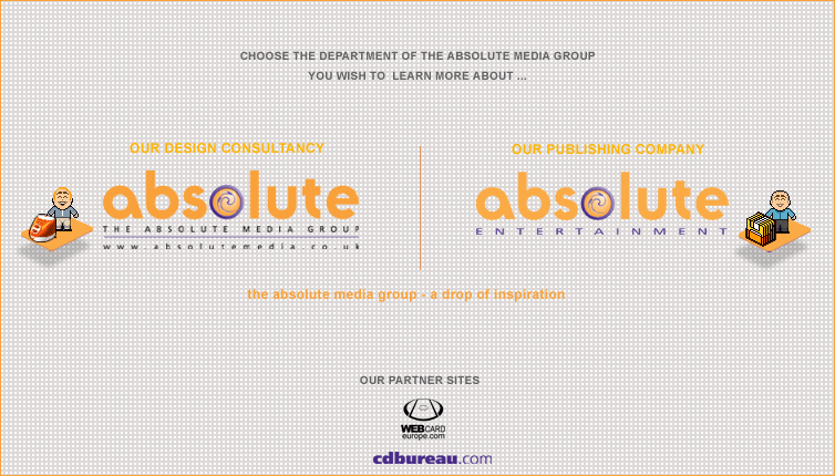
At this point, Absolute was growing quickly, so Chris decided to expand his agency by opening a sister publishing company called ‘Absolute Entertainment’. The design team stepped in and gave the brand a bit of a refresh. They created an additional identity and introduced some little isometric icons that added a bit of playfulness. These were yet another design trend instigated by the lovely creative people at places like Apple and Microsoft to liven up their desktop interfaces. A lot of companies around that time created sets of these stylised icons and sold them on CD Rom’s. Tech savvy people even personalise their desktops by changing the standard software icons with their own versions. Nice.
Unfortunately for Absolute, CD Rom’s were quickly being phased out due to the rapid growth of the world wide web. The internet was always lurking around the corner, it just needed everyone to embrace it, along with a lot of investment to make it more accessible to businesses, and then to home users.
Absolute embraced the change, and the agency made a shift change too, focusing more on designing and building websites, whilst offering up other creative print services too. The digital world started off quite basic with websites just containing text and images, but it was the creative industries that really pushed the boundaries of technology. Absolute was once again leading the way, this time with innovative website builds that looked great too.
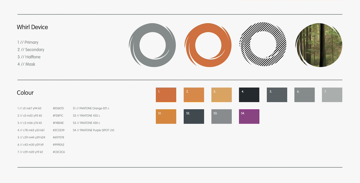
This called for another rebrand for the agency, so the creative team stepped up again. With the onset of the ‘designed website’ culture, branding systems had to be adaptable and flexible enough to work both online and offline. The creative team reworked some of the original features like the ‘Whirl Device’ along with the typography, and introduced an additional colour palette for flexibility. It was now starting to look more modern, whilst shaking off the overuse of Photoshop effects.
The arrival of our current Creative Director in 2013 triggered yet another rebrand. Absolute was strengthening in all areas of brand, campaign and digital, so it needed a bold new look to reflect the agency’s repositioning and increased service offering.
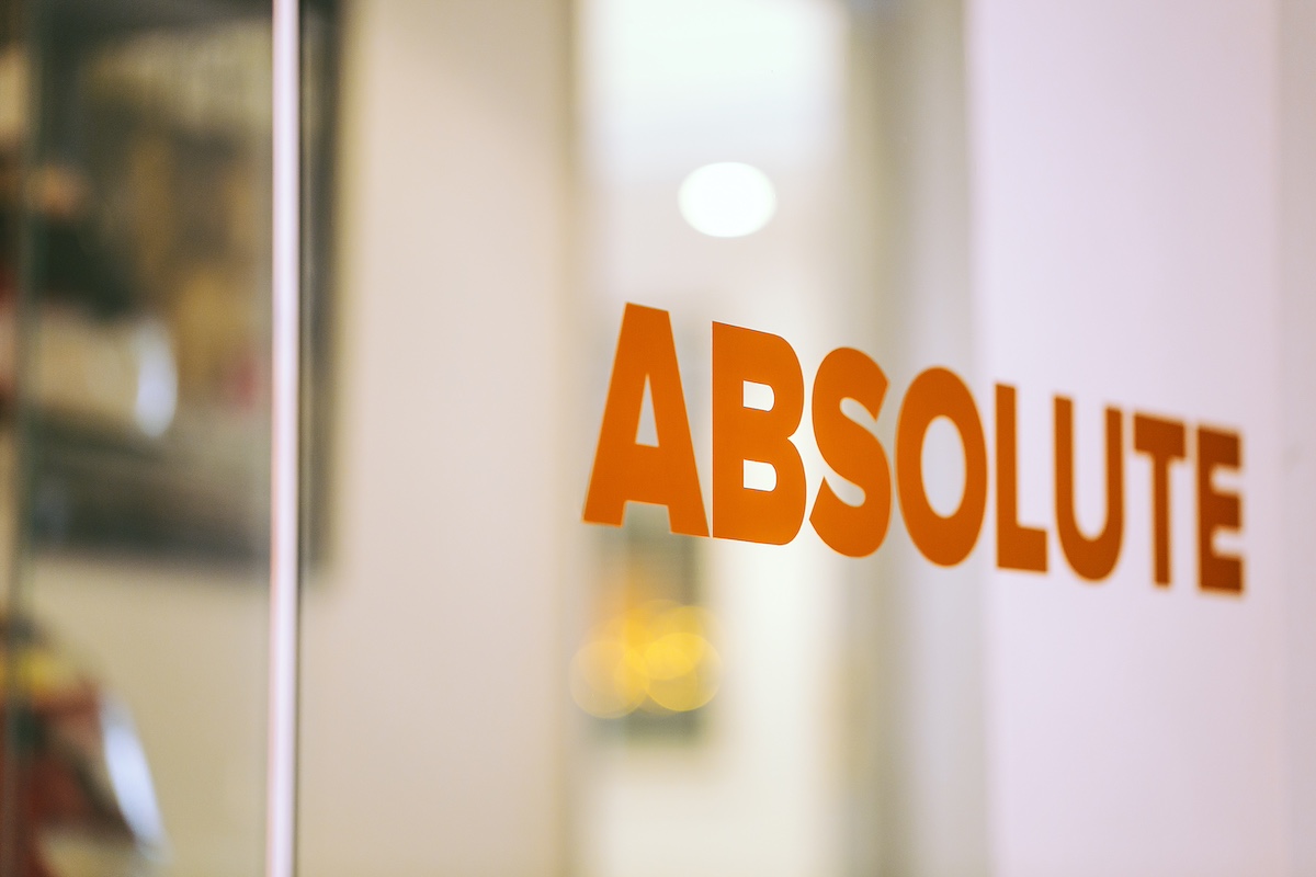
The brand was stripped back even further. A new logotype was introduced, along with a more vibrant orange. The additional colour palette had now gone, and the emphasis was on using more of the white with the orange to brighten everything up, rather than the black. The biggest change was the removal of the ‘Whirl Device’ which had been part of the brand since 1999, but wasn’t as relevant anymore.
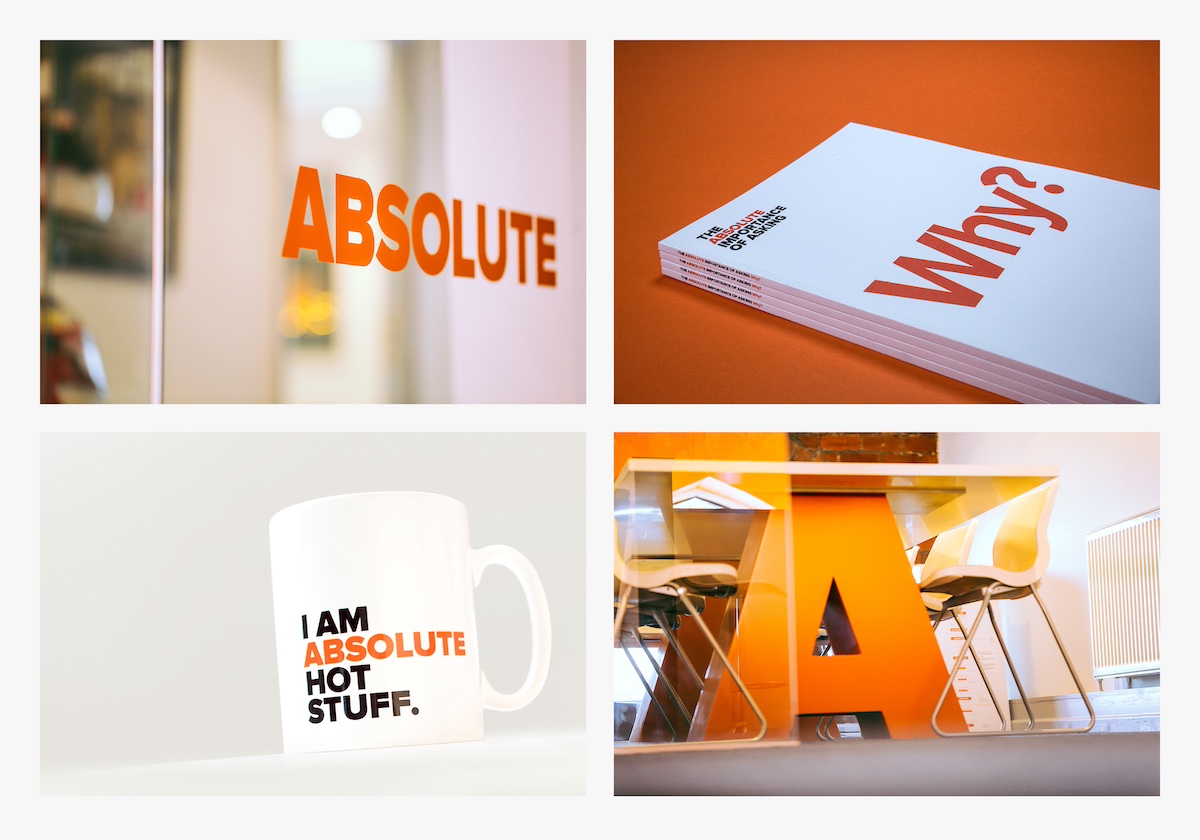
The new brand quickly became part of the furniture, literally, with the cap ‘A’ featuring on meeting room tables and as door stops in the studio. A brand is much more than the logo. The brand narrative is just as important, in terms of communicating our personality, and point of difference. A more playful and engaging narrative was introduced across all applications including a cup, which became very popular with our clients.
As an agency that’s 25 years old, we know that you can’t stand still. We’re always looking at our brand and positioning to see if it still stands up, and to make sure it’s still relevant. So, in 2019 we started to freshen things up again. Instead of totally rebranding, we undertook a brand development exercise to strengthen the brand essence and change our positioning, which was also an opportunity to go a bit bolder too.
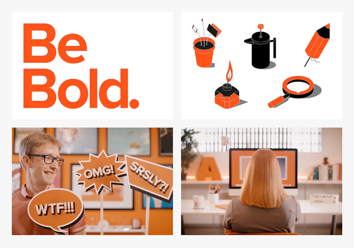
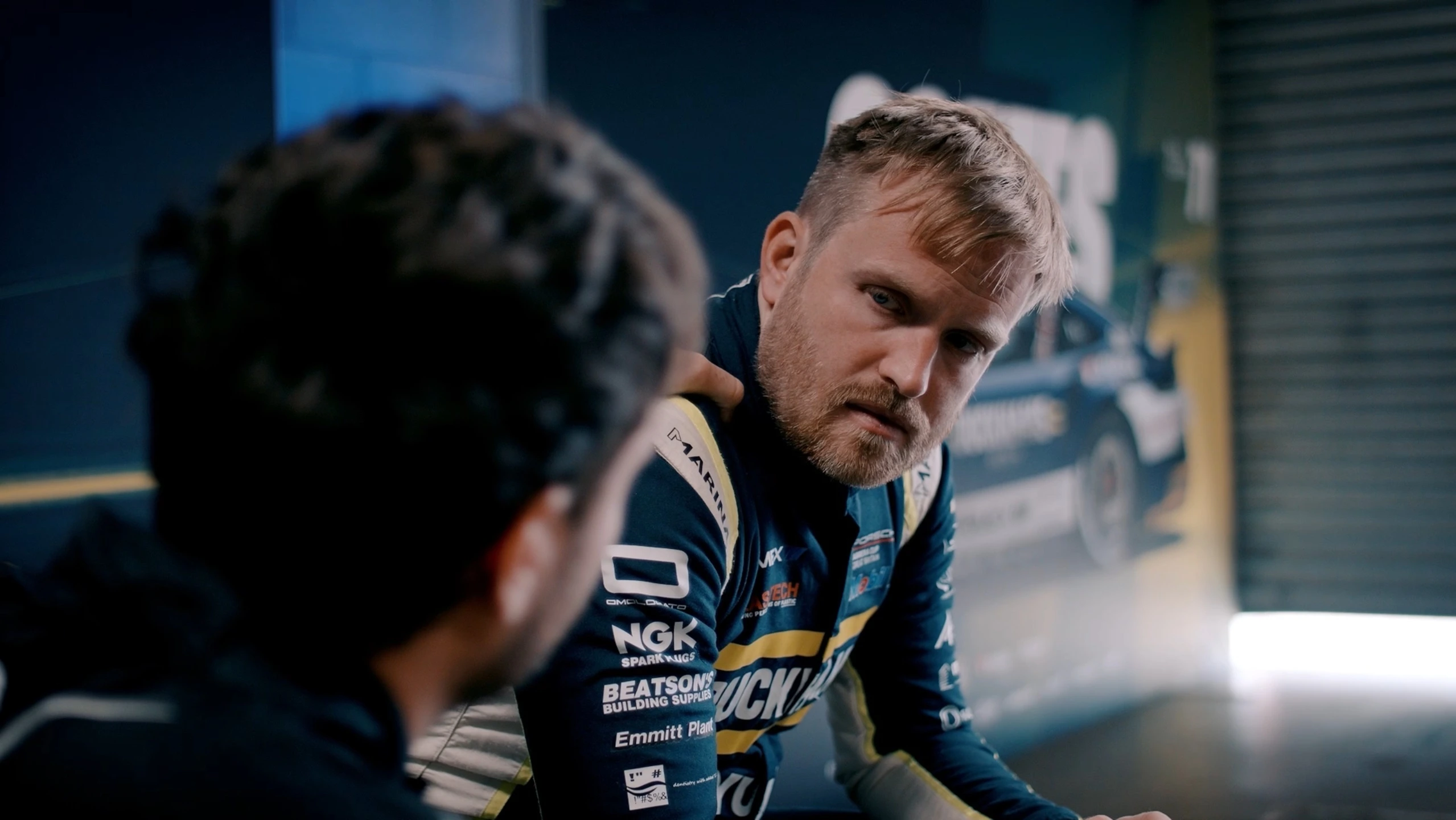
We introduced some new isometric graphics that illustrate our different services, with a little bit of wit. And to communicate our new essence and agency culture, we decided to produce a video (link here). It only took 2 years for it to happen, mainly due to some global pandemic (remember that?).