Realigning a national brand to match the quality of its homes.
The new Redrow brand finally
reflected the quality of the homes, creating a more premium and distinctive customer experience.
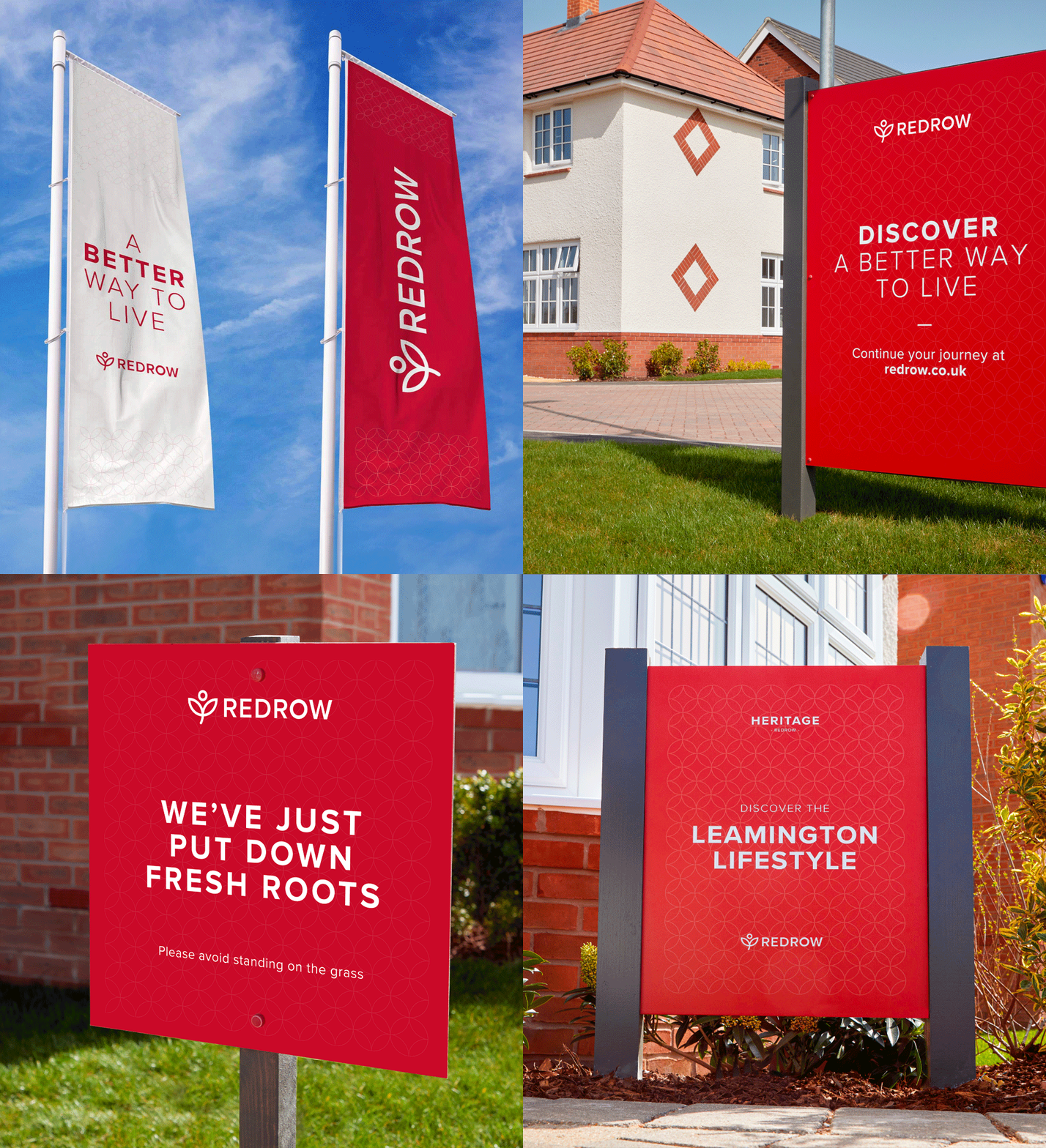
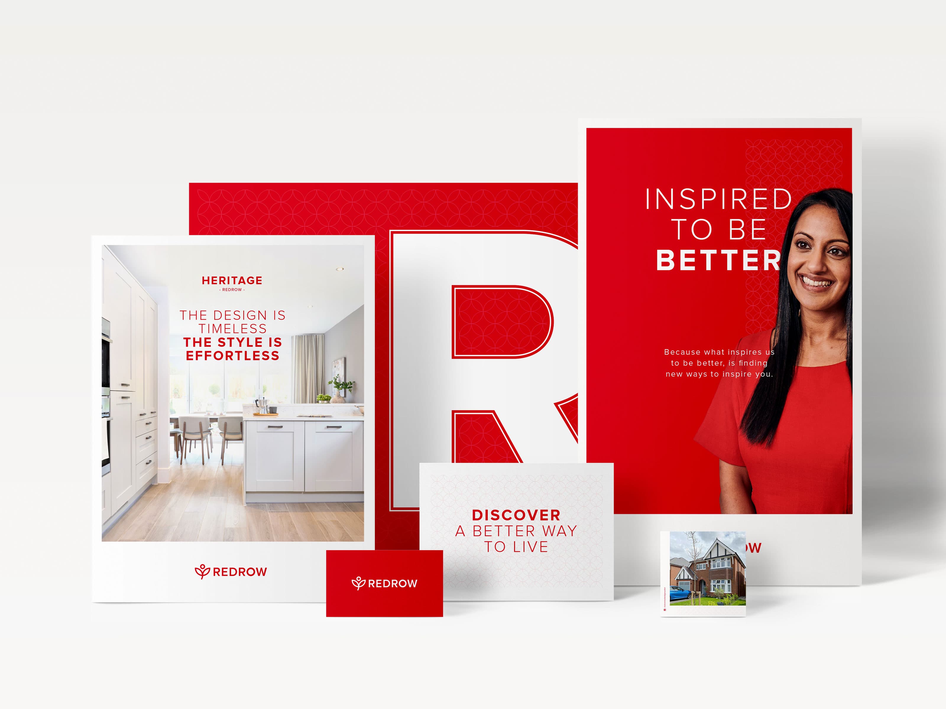
Taking a less-is-more approach,
the new brand system brought
clarity, consistency and confidence
to every touchpoint.
Process
for Growth
A proven process that gave Redrow the clarity, creativity and consistency to realign their brand with the quality of their homes.
Here's what we delivered in each phase:
Discovery
Uncovering insights through:
- Brand & Customer
- Landscape Audit
- Site Visits
- Mystery Shopper Research
- Competitor Analysis
Clarity
Defining the brand with:
- Brand Architecture Review
- Positioning & Framework Development
- Narrative Pillar Creation
- Strategic Brand Recommendations
Vision
Exploring creative directions through:
- Essence Development (A Better Way to Live)
- Narrative Pillars (Better by Design, Better Places, Better Experiences)
- Visual Identity Concepts
- Brand Architecture Simplification
Reality
Bringing it to life through:
- Brand Guidelines
- Marketing Collateral
- Campaign Direction
- Sales Environment Applications
- Signage, Hoardings & Wayfinding
From specialist supplier to category leader – we help ambitious brands make the shift.
Book a free Brand Discovery session to help you take the next step.
The Challenge
Redrow is one of the UK's leading housebuilders, known for creating high-quality homes.
But while the product and customer experience felt premium, the brand didn't reflect that. Communications were inconsistent across regions, with individual product identities overshadowing the core Redrow brand. The result was a mistmatch: the quality of the homes wasn't matches by the clarity or strength of the brand - creating confusion for customers and limiting growth.
Our Approach
Realigning Redrow meant stengthening the core brand.
This wasn't about surface-level changes - it was about addressing the gap between perception and reality. Redrow's homes were premium, but the brand didn't reflect that. Our role was to step back, uncover the truth through research, and build a clear stategy and creative system that put the Redrow brand back at the centre, ensuring every customer experience matches the quality of the product.
- Discovery
- We began with a comprehensive brand and customer landscape audit. This included development site visits across London, the Midlands, Yorkshire and the North West, where we assessed every stage of the customer journey - from first impressions at hoardings and signage, to sales environments and show homes.
- To get a true picture of public perception, we also carried out a mystery shopper excercise with Redrow customers. Alongside this, we delivered an in-depth competior analysis, bechmarking strengths, weaknesses and gaps across the sector. The findings were clear: individual product brands were overshadowing the core Redrow name, creating inconsistency and weakening the premium perception of the business.
- Clarity
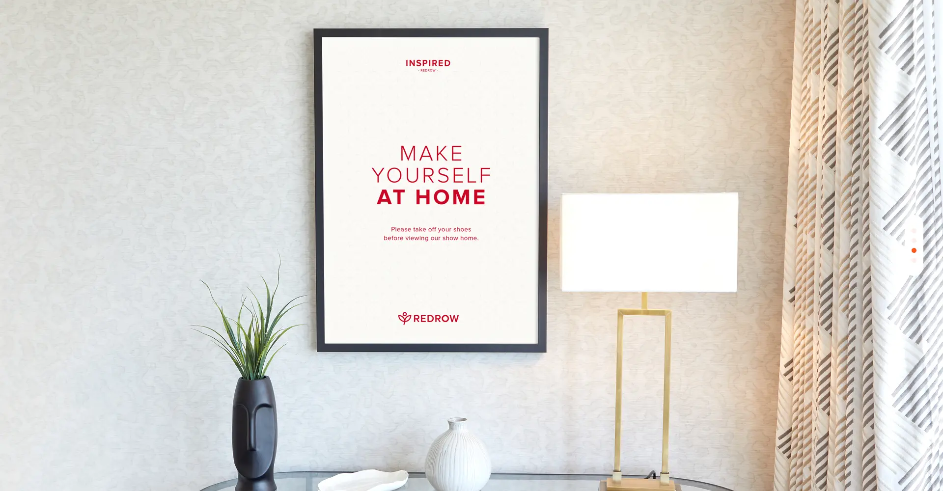
- Our recommendation was simple: start, and lead, with the Redrow brand itself. By putting the master brand at the centre and restructing the product hierarchy, we created a stronger foundation for growth. Multiple product brands were rationalised into three clear pillars - Hetirage, Inspired and Trailored - bring order and clarity where there has been fragmentation.
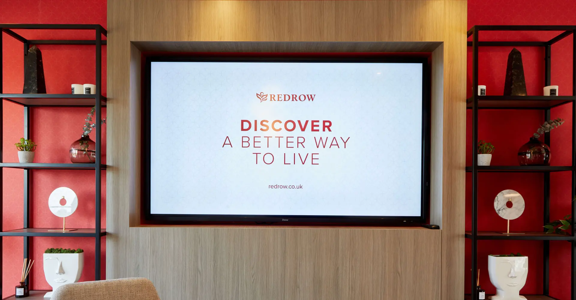
- The strategy also made more of the essence "A Better Way to Live." This wasn't treated as a line, but as a guiding principle that shaped every decision, from brand messaging to the customer experience. Taking cues from the retail sector, we defined a brand that was more premium, consistent and engaging - designed to feel simpler, clearer and more memorable at every touchpoint.
- Vision
- We translated this strategy into a bold creative direction anchored in the essence "A Better Way to Live." Redrow's original brand framework has been fragmented into too many messages, making it hard to communicate with clarity. We distilled this into three clear narrative pillars - Better by Design, Better Places, Better Experiences - capturing what makes Redrow distinct while creating a simple, memorable story for customers.
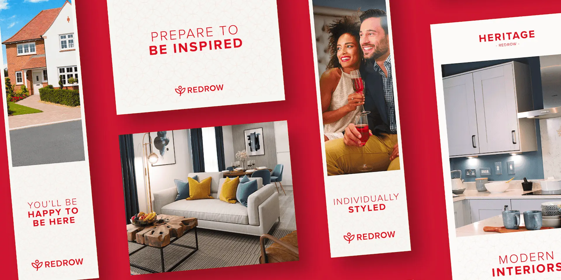
- To support this, we developed a refreshed brand architecture that put the Redrow name firmly at the centre, with product ranges aligned under it. The creative direction followed a "Less is More" apprach - stripping the brand back to give it a more premium, confident feel. To balance this simplicity, we introduced an Arts & Crafts inspired brand pattern, adding texture and quality across applications and connecting back to Redrow's design heritage. A new brand personaility underpinned the work, making communications more engaging, conversational and human, while retaining the authority and trust of a national housebuilder.
- Reality
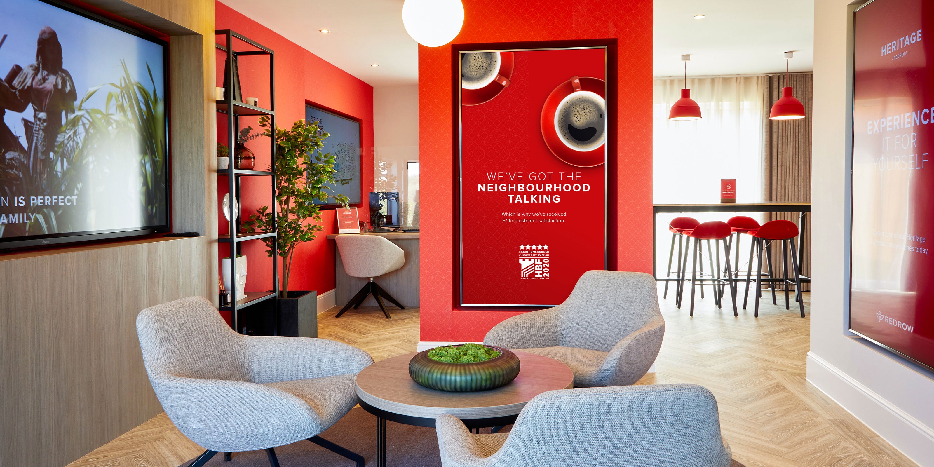
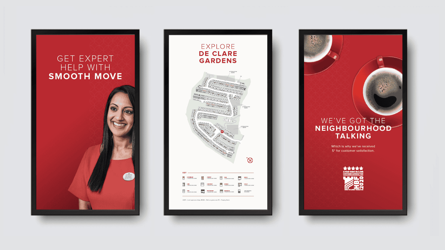
- The new brand was rolled out acorss sales centres, show homes, campaigns and onsite communications. But the work went far beyond design. Together with Redrow's in-house marketing team, we developed a comprehensive set of digital brand guidelines, ensuring consistency across print, digital and regional communications.
- We helped introduce a digital-first approach to sales centres, making the customer journey smoother, more engaging and more consistent with the premium brand - from first enquiry through to after-sales. Alongside this, we worked on the frameworks for Redrow's application software, Paperfly, which allowed regional teams to product advertising and promotional materials to specific media sizes without compromising the integrity of the brand.
- By Unifying the brand structure, simplifying the story, and embedding digital-first tools and systems, we gave Redrow a platform that not only matches the quality of their homes, but also made the brand easier to manage, scale and protect nationwide.
Applethwaite
Homes Full of Happy Moments