Strengthening a fragmented national trailer brand

and simplified through one
clear, dynamic brand.
Process
for Growth
A proven process that gave Indespension the clarity, creativity and consistency to unify its identity and reignite growth.
Here's what we delivered in each phase:
Discovery
Uncovering insights through:
- Brand Audit (Depots / Vehicles / Literature / Digital)
- Customer & Staff Insight
- Competitor Analysis
Clarity
Defining the brand with:
- Brand Workshop
- Purpose Positioning & Values
- Brand Personality & Difference
- Strategic Brand Frameworks
Vision
Exploring creative directions through:
- Brand Essence & Narrative
- Visual Identity Concepts
- Campaign Concepts
- Creative Testing
- Creative Development
Reality
Bringing it to life through:
- Nationwide Depot Rebrand
- Vehicle Livery
- Signage
- Uniforms
- Collateral
- Digital Channels
- Brand Guidelines & Governance
From specialist supplier to category leader – we help ambitious brands make the shift.
Book a free Brand Discovery session to help you take the next step.

Got a project in mind? Talk to Chris
Share a few details below and we'll be in touch to talk it through.
The Challenge
For more than 50 years, Indespension had built a name in towing, trailers and equipment hire. But despite its heritage and nationwide footprint, the brand was in decline.
The issues were easy to see. Multiple conflicting logos and identities appeared across depots, vehicles and collateral, with no clear guidance to hold everything together. Depots felt functional rather than welcoming to the wider public, and the overal brand came across as fragmented and dated. This create a mitmatch between Indespension's strong reputation in the trade and the way it was perceived by customers - with sales under pressure struggling to present itself as a confident, modern operation.
Our Approach
Repositioning Indespension meant going far beyond a surface-level refresh.
The brand needed a complete transformation - one that modernised its identity, created consistency across the nationwide network, and made the business feel approachable to a wider audience. Through our collaborative process, we worked with the team to uncover the real issues, define a clearer direction, and build a brand that was simple eto understand, easy to apply, and strong enough to grow with.
- Discovery
- We began with a comprehensive brand audit of Indespension's depots - visiting Glasgow, Carlisle and Bolton, and reviewing client-supported photography from other sites across the UK.
- What we found was clear. The depots had been designed with trade customers in mind - builders, engineers and farmers - but felt far less welcoming for the gernal public looking for a retailer, towbar or bike rack. Environments came across as dated and functional rather than customer-friendly, with inconsistent signate and entrances that weren't always obvious.
- Across the network, multiple logos, fonts and visual styles created confusion. The overall impression was framented and lacking cohesion, with little sense of a national brand presence. Indespension needed to feel more accessible, consistent and modern - a brand environment people could trust and recognise wherver they went.
- Clarity
- Through a brand workshop, we helped Indespension define what truly set them apear. Their strengths were clear - deep technical knowledge, a wide product range, the ability to customise, and a nationwide depot network. But these advantages were being lost in fragmented branding and a dated customer experience.
- Together we distilled the brand into a sharper strategy. Indespension would modernise while holding onto its heritage, align every depot and channel under a single identity, and present itself with the approachable. helpful and knowledgeable personaility that staff and customers already recognised. This gave the business a strong platform for growth - and a brand the whole team could believe in.
- Vision
- With clarity established, we translated it into a bold creative system and brand essence: We're in the Know. This captured Indespension's role as the trusted expert in all things towing - solid, dependable and built on over 50 years of experience, but now presented with the confidence of a modern national brand.
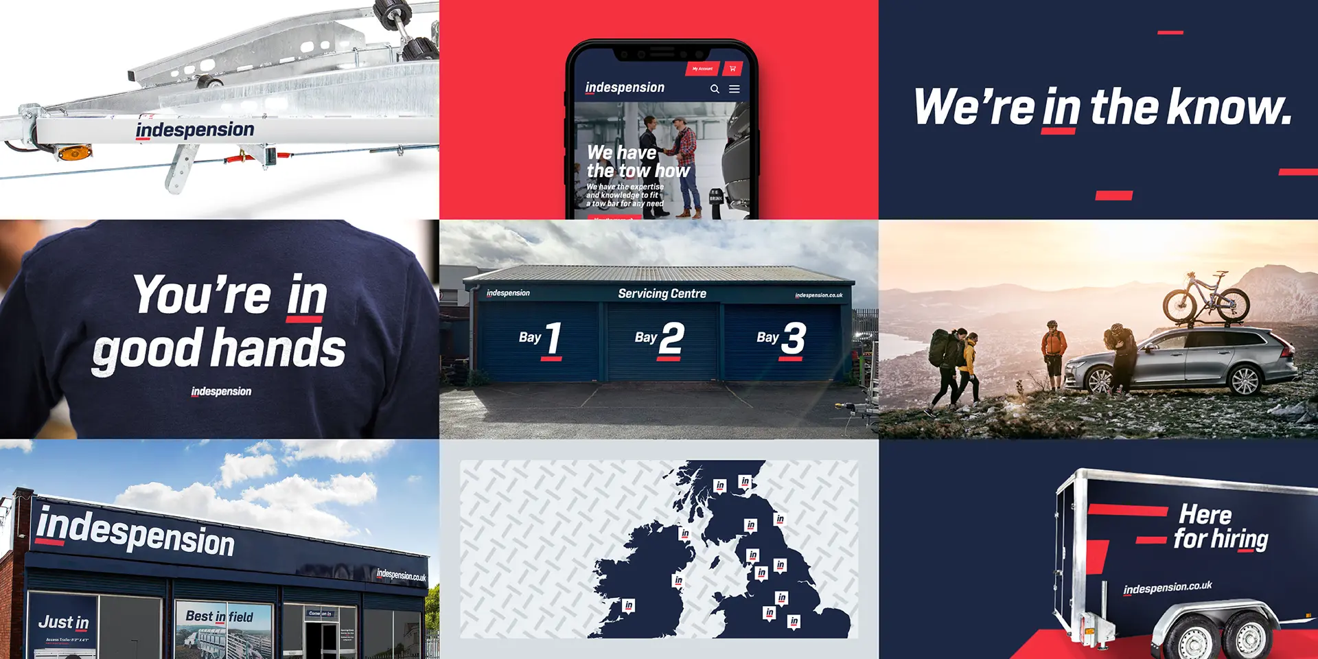
- The visual identity was designed from the group up. The clutter of competing logos was replaced with a single, consistent mark, supported by the distinctive red underscore device, Tamba Sans typography and a confident palette of dark blue, bright red and metal grey. Photography and messaging put people people and expertise at the heart of the brand, bringing personality and accessibility to every touchpoint.
- Reality
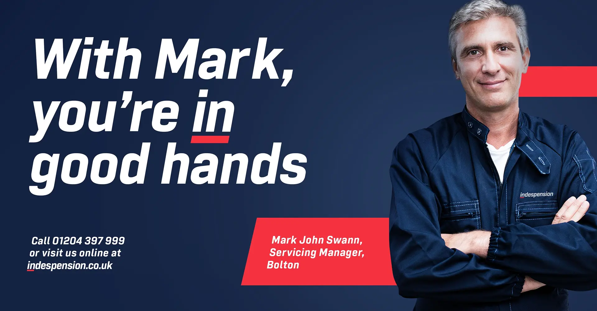
- The results of the rebrand could be seen everywhere. Depots that once felt dated and inconsistent were unified under a single, confident identity. Bold signage and wayfinding made the spaces more welcoming, while van livery, staff uniforms and in-store graphics carried the same cohesive look and voice.
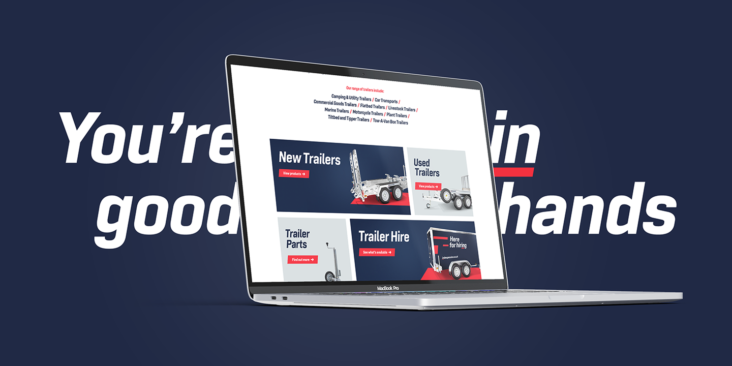
- Campaigns and advertising used the red underscore device and lifestyle-led messaging to inject character and expertise into every communication. Digital channels, literature and promotional materials all adopted the new system, supporting by clear brand guidelines that equipped the team to keep everything consistent.
- What had been one of the most framented brands in its sector was transformed into a modern, professional and nationally recognisable presence. Staff coulf feel proud to represent it, customers could clearly identify it, and Indespension finally looked like the market leader it had always aspired to be.
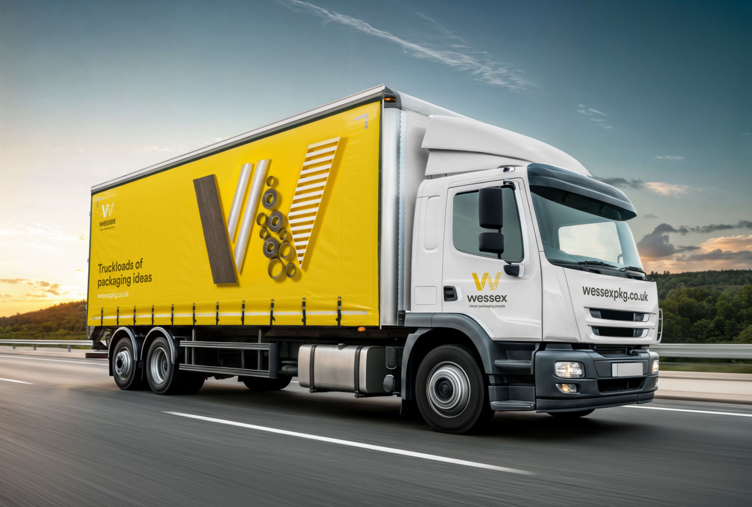
Wessex Packaging
Wessex Packaging