Unlocking growth for a nationwide packaging brand.
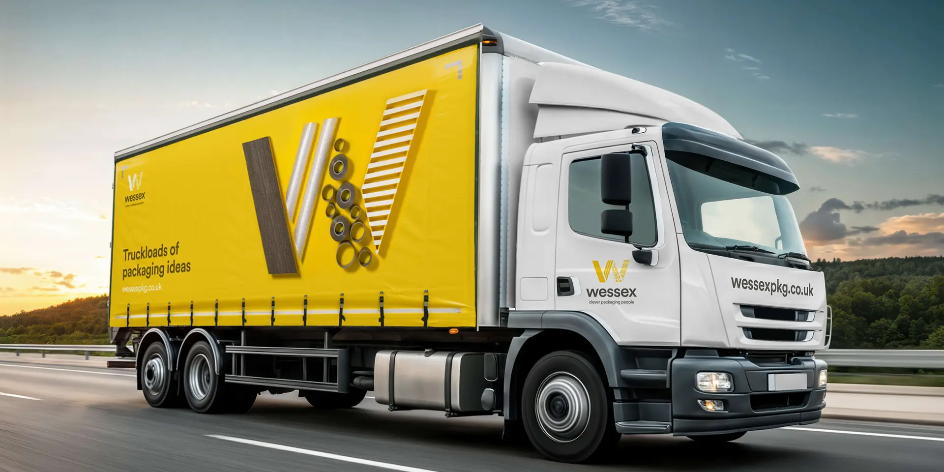
The new brand unlocked growth
and turned Wessex into a confident nationwide leader, not a local player.

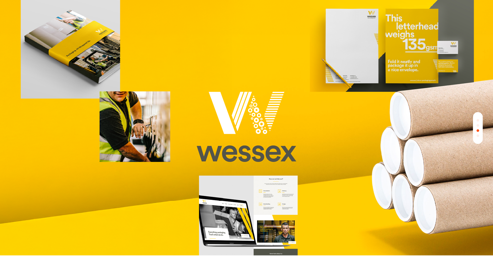
A bold identity with personality
and clarity and every touchpoint.
Process
for Growth
A proven process that gave Wessex the clarity, creativity and consistency to unlock growth.
Here's what we delivered in each phase:
Discovery
Uncovering insights through:
- Brand Audits
- Competitor Analysis
- Customer Insight
- Employee Workshops
Clarity
Defining the brand with:
- Purpose, Positioning & Difference
- Strategic Brand Frameworks
Vision
Exploring creative directions through:
- Brand Essence & Narrative
- Brand Personality
- Visual Identity Concepts
- Colour Palette & Design System
- Creative Development
Reality
Bringing it to life through:
- Vehicle Livery
- Website & Digital Channels
- Photography
- Stationery & Collateral
From specialist supplier to category leader – we help ambitious brands make the shift.
Book a free Brand Discovery session to help you take the next step.
The Challenge
With almost 50 years of history, Wessex Packaging had strong operations but flatlined sales.
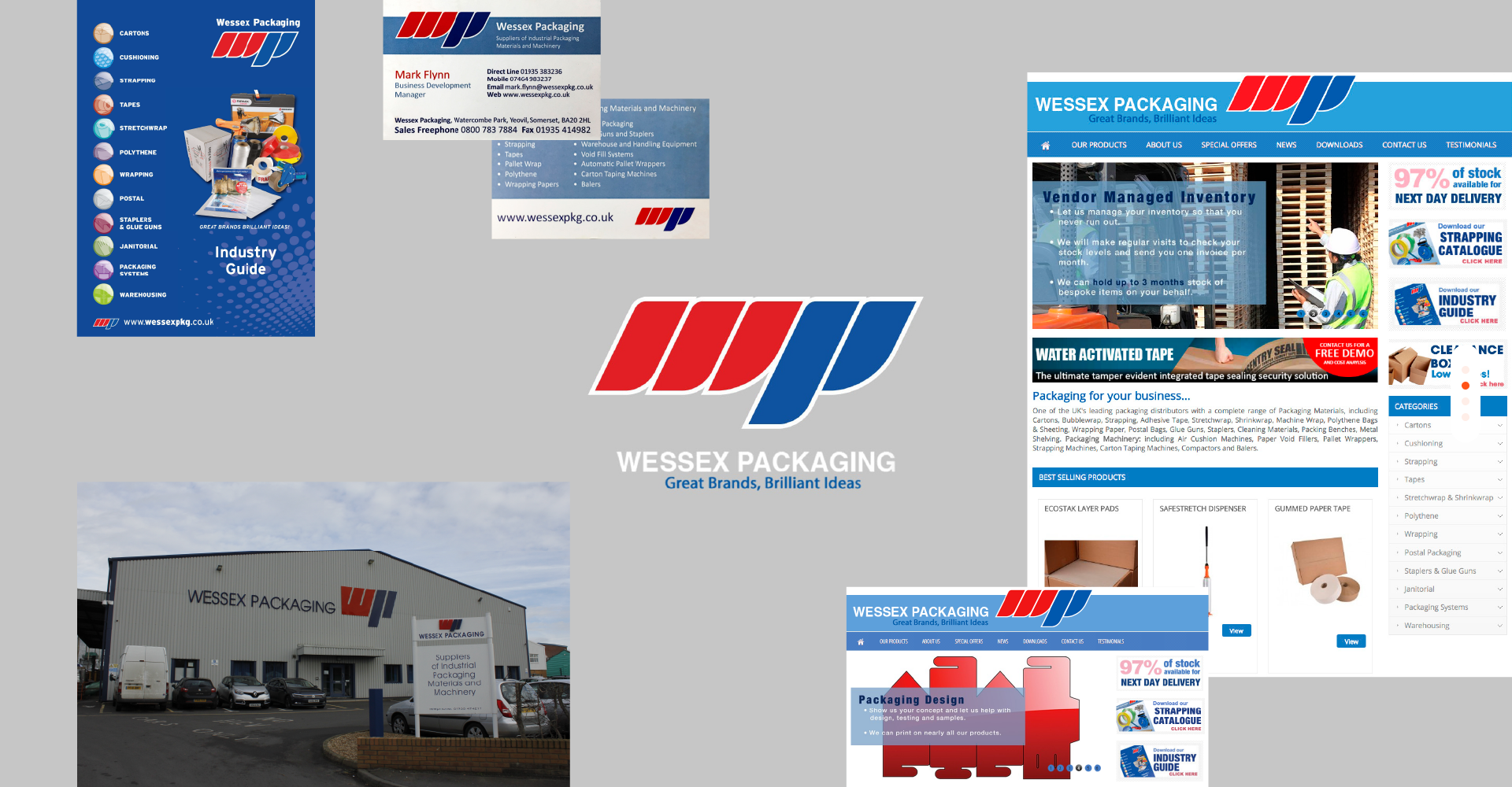
Wessex Packaging came to us believing their name was holding them back. But our discovery process uncovered the truth - the business wasn't losing sales because of its name, it was competing on price. Despite operating nationally, the brand looked and behaved like a small local supplier. It lacked the confidence and clarity to communicate its real stengths - innovation, trust, and scale.
Our Approach
We started by stripping everything back to uncover the truth: how the business was seen, what really set it apart, and why growth had stalled.
What we found was clear: Wessex had the scale and ambition of a national player, but the brand positioning wasn’t telling that story. Through our collaborative process, we built a sharper brand strategy and a bold new identity that captured the energy inside the business. This wasn’t just about creating a stronger look — it was a complete brand transformation in how Wessex thought, spoke and positioned themselves in the market.
- Discovery
- Our brand audit confirmed the gap between perception and reality. Despite operating nationwide, Wessex looked like a regional supplier — with dated branding, generic messaging and little personality. Competitor analysis showed that others were beginning to modernise, while Wessex had been left behind.
- Customer insight uncovered the biggest misalignment: Wessex believed clients were mainly focused on cost, but what customers actually valued was quality, reliability and smarter service. By underselling its true strengths, the brand was missing the chance to position itself as a trusted nationwide partner.
- Clarity
- Through workshops with the leadership team, we focused on defining Wessex’s real difference. What emerged was clear: beyond being a reliable supplier, the business was creating smarter packaging solutions — innovations designed to save time, improve efficiency and even reduce workplace injuries.
- We sharpened this into a clear brand positioning and strategy that emphasised intelligence and innovation over price. This gave Wessex a more ambitious platform to grow from, and a brand direction that customers could believe in.
- Vision
- With the strategy defined, we developed a creative brand identity that expressed Wessex’s difference and gave them a bold, distinctive personality. At its heart was the brand essence Clever Packaging People – positioning Wessex as innovators who go beyond boxes to solve problems smarter.
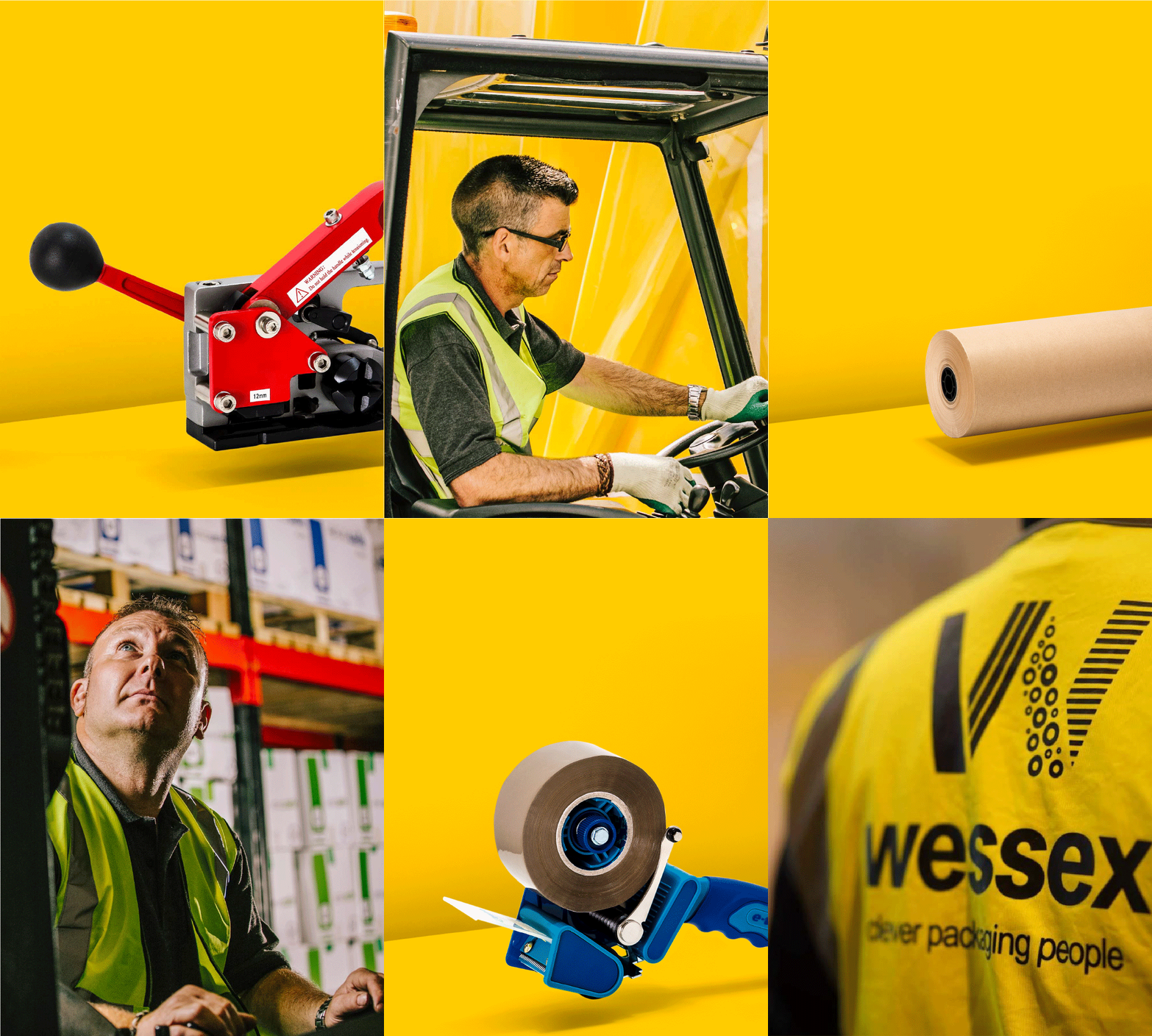
- A key step in differentiation was moving away from the sea of blue-and-red competitors. We introduced a confident yellow and earthy brown palette, inspired by the materials at the core of the business — cardboard boxes, packaging tubes and parcel tape. The result was a look that felt warmer, more human, and unmistakably Wessex.
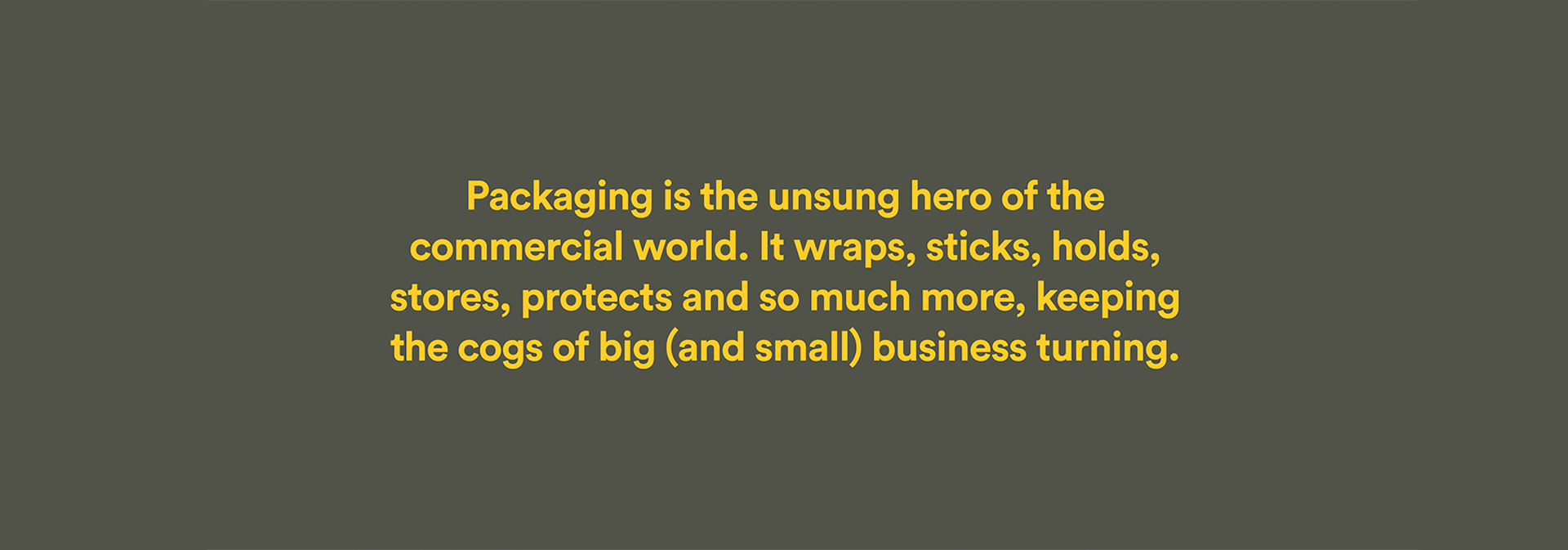
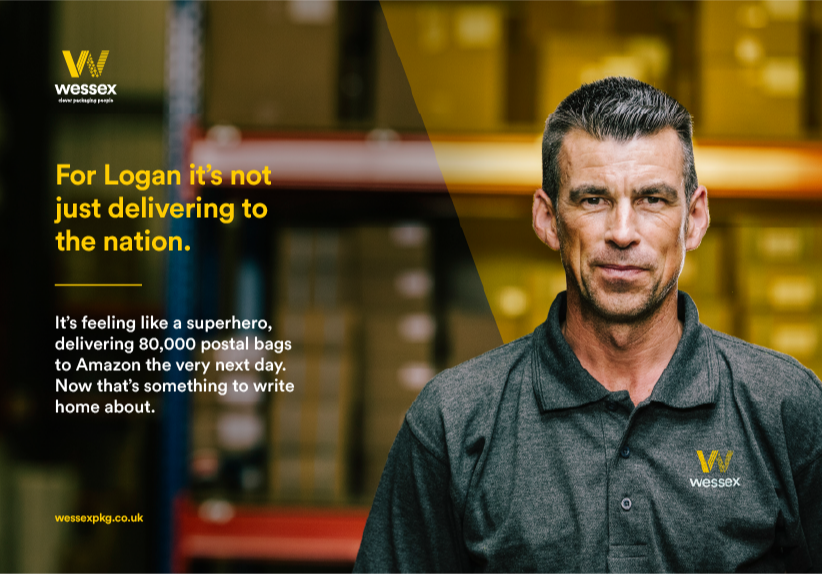
- We also gave personality to the packaging itself, bringing it to life in the narrative as the “unsung hero” of the commercial world. At the same time, the brand celebrated the people who keep that world moving — delivery drivers, warehouse teams and office staff — making them central to the story.
- The new W symbol brought it all together. Constructed from packaging materials, it became a distinctive, ownable mark that reflected both the products Wessex supply and the clever thinking behind them.
- Reality
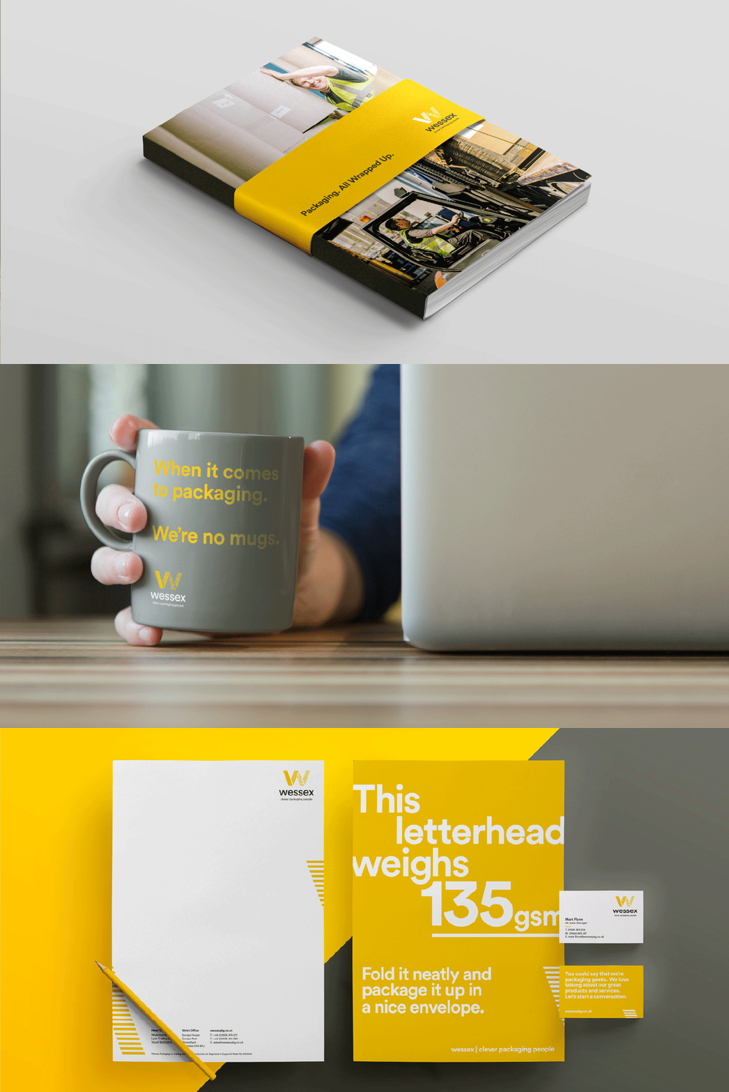
- The new brand personality came through in every application – from the iconic yellow delivery vehicles that became moving billboards, to stationery that carried a touch of wit. Photography played a major role: we shot Wessex’s team at their head office and warehouse, and created studio imagery of hero products and the W symbol crafted from packaging.
- The website became the central channel for the new brand, combining clarity of navigation with bold storytelling. But the impact went further. The rebrand gave Wessex the confidence to invest in a smart new building, with the W icon sitting proudly in reception. Growth followed quickly — what started with a single truck soon became a fleet, all carrying the bold new identity across the UK.
- The result was a brand transformation that didn’t just look different, but felt transformed — consistent, confident and instantly recognisable.
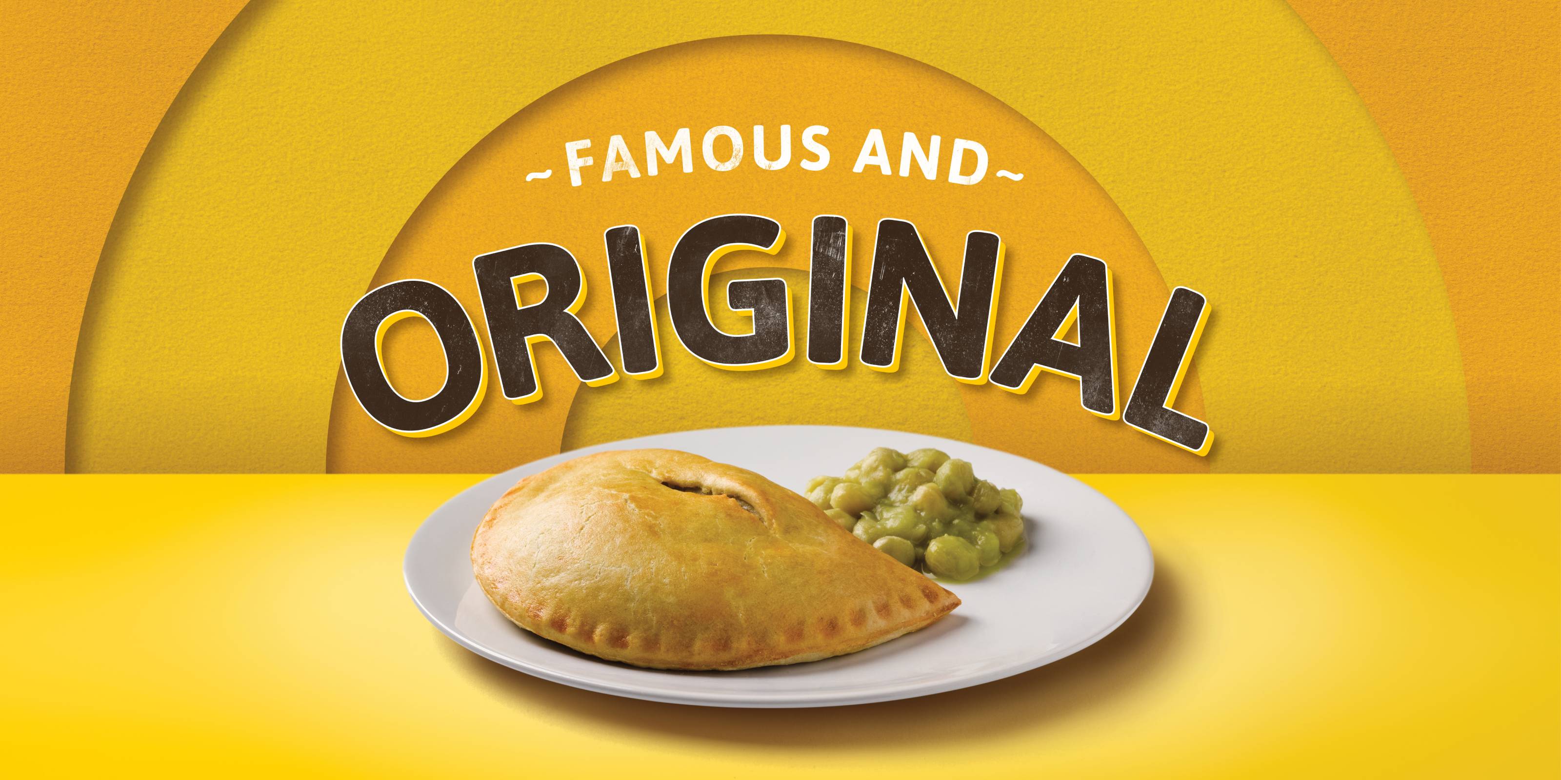
Carrs Pasties
A Tasty Refresh