
The Keoghs difference
Our client Keoghs, a top 100 law firm, wanted to develop their brand identity for rollout across all marketing communications. The evolution needed to take into account their history and heritage whilst future proofing the firm.
Keoghs is a well respected leading law firm with a strong brand in the market place, our work had to move the brand forward whilst being sympathetic to the brand assets currently in use.
Absolute had designed and built the existing Keoghs website and had worked with Keoghs on various other projects so were perfectly placed to take on this brand development project.
Law firm brands traditionally lack personality and creativity, however as an innovative firm, Keoghs needed to break the mould but within the constraints of the highly regulated environment that they operate in.
Keoghs aim to be recognised as the leading provider of dispute resolution services to the UK insurance industry, so the branding had to reflect this ambition.
In depth research sessions took place to understand what the essence of the Keoghs brand is. It became clear that it’s the people and the insight at Keoghs that make the difference. And so the idea of the ‘The Keoghs Difference’ was born.
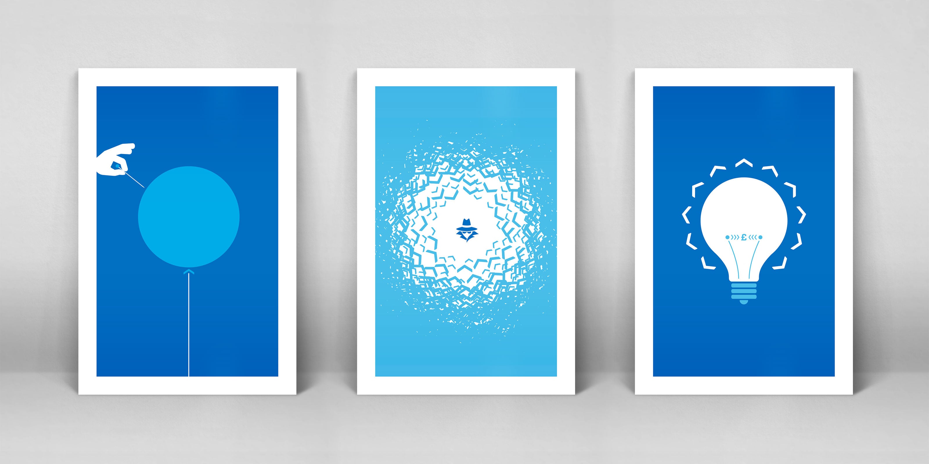

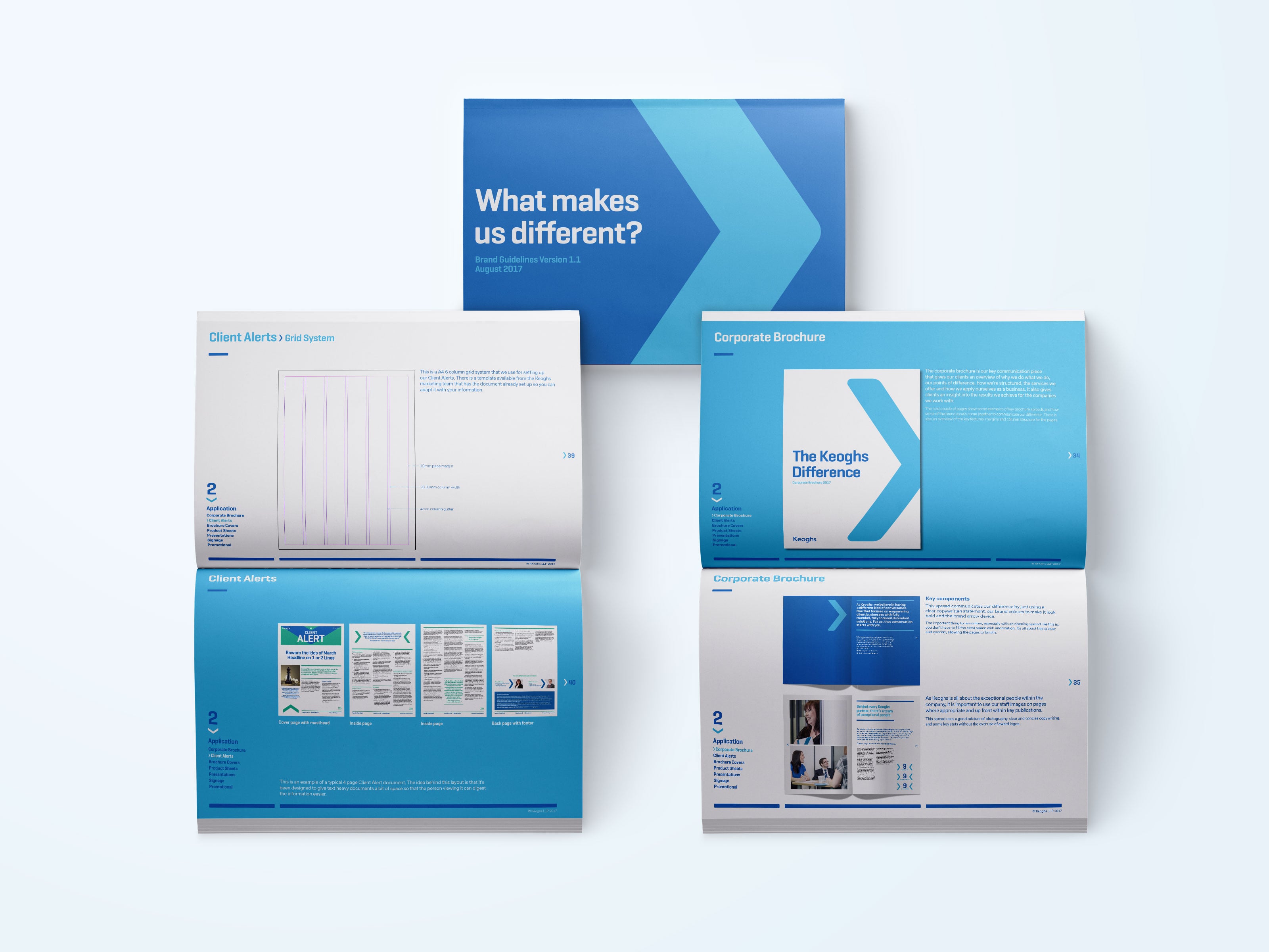
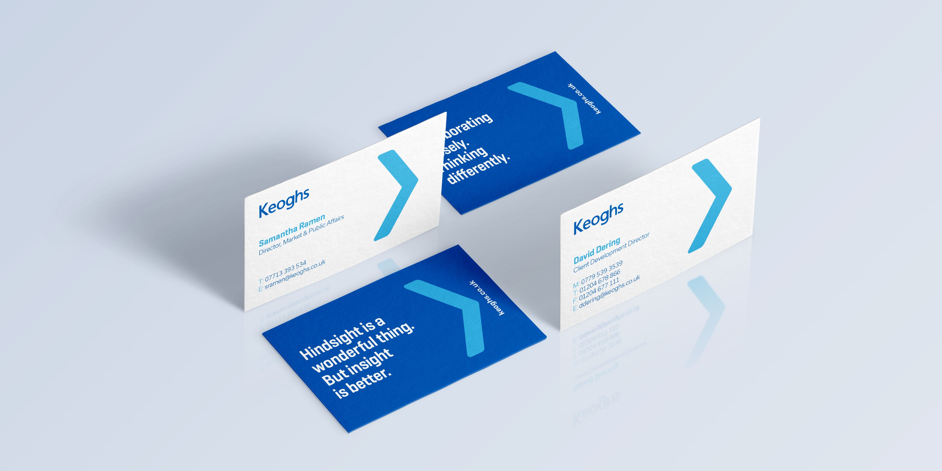
To move the visual identity on and create a consistently recognisable device that could be applied across all of the creative work, we developed part of the ‘K’ to form an arrow to be used in a number of ways – as an illustration, to draw attention to key points and to direct readers through longer, more technical documents.
A toolkit of graphics, illustrations, icons and existing brand assets were created to bring out the personality in the brand. The illustrations create endless roll out options which gives Keoghs the ability to add creativity to technical content to get their messages across visually.
The existing site, designed and built by Absolute was nominated for a DADI award and had lots of functionality and engaging content. Our work was to apply the new brand elements across the site, add additional functionality which included redesigning the homepage to feel more like a news site, enabling Keoghs to update content on a daily basis.
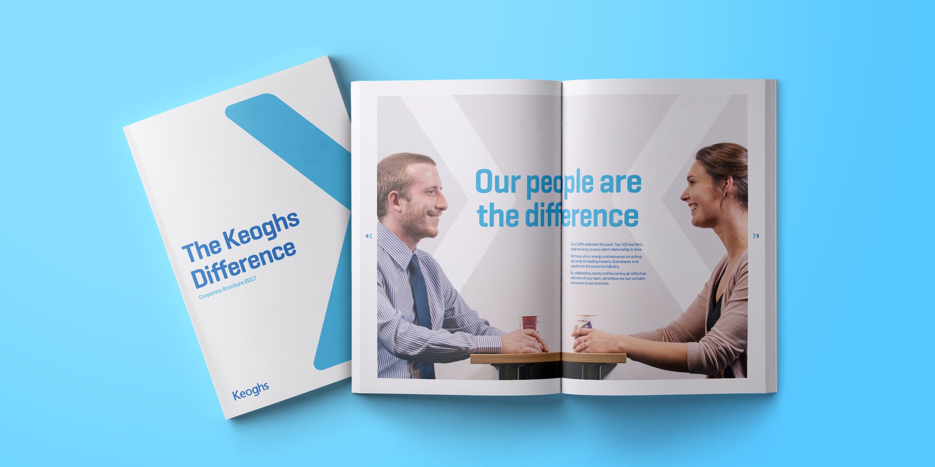
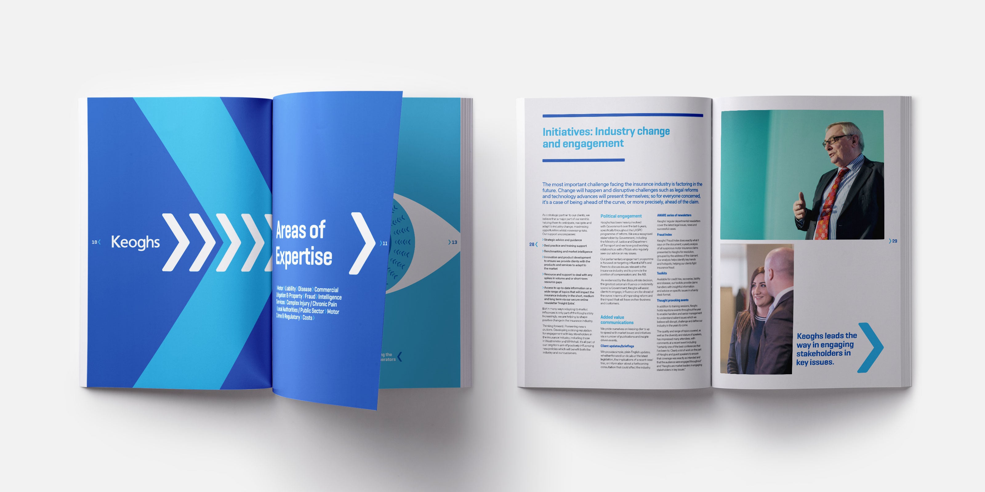
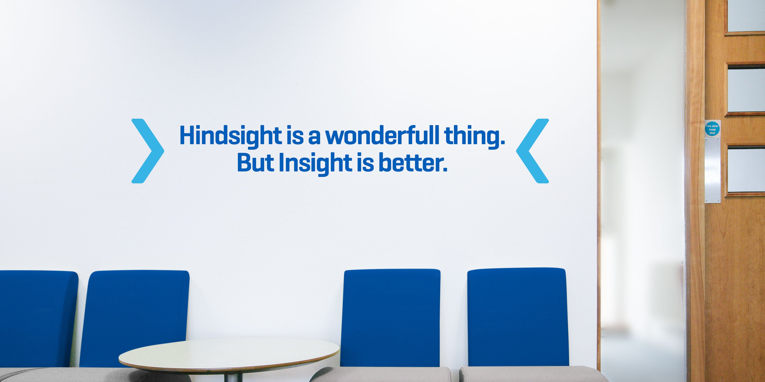
Keoghs is now a brand with a difference. The values have been carefully put together and then communicated creatively to achieve a visual execution that resonates with its audience in a clear and powerful way.
They have a valuable toolkit to roll out across all external and internal documents to ensure consistency and protect the integrity of the brand moving forward.

Dandara
Dandara